A French shaker seals with nothing but two pieces of steel — no threads, no lugs, no gasket. That means only two things can go wrong: it leaks while you shake, or it locks shut after you do. Both come from the same set of dimensions. This is the engineering behind that joint: why it has to be a shallow cone rather than a press fit, the four values E-BON sets before cutting tooling (8–12 mm engaged length, 2°–3° taper per side, 0.10–0.25 mm interference, 0.5–1.0 mm axial clearance), why roundness rather than diameter is what buyers feel, why the mouth needs a separate sizing die after springback, and why a plated version cannot share the same mouth dimension as an unplated one.
Consolidates the etched-tumbler cluster from the 40-topic pool (production checklist, artwork requirements, defect prevention) into one buyer-facing guide: what etching is and how it differs from printing/debossing/embossing, artwork file requirements before quoting, defect-prevention checkpoints specific to etched surfaces (etching depth, edge deburring, pattern registration, cross-finish consistency), and MOQ/packaging using the real egg-shaped 20oz 304 stainless tumbler as a reference spec.
Explains the material difference between 304 and 201 stainless steel, why 201 shows up in aggressively priced barware quotes, where the difference actually shows up after an order ships (corrosion, finish stability, the unreliable magnet-test shortcut), and gives buyers a concrete way to confirm grade in writing before comparing supplier quotes.
Gives B2B barware buyers a practical way to tell a manufacturer from a trading company, explains what ISO 9001, Sedex 4-Pillar, and BSCI audits actually verify, and covers third-party testing and export documentation to confirm before sending an RFQ.
A practical quality control checklist for importers and private label brands inspecting cocktail shaker samples and bulk lots. It covers approved references, Boston and Cobbler fit, leak testing, formed edges, dimensions, capacity, finishes, logos, function, packaging, defect records and lot release.
This BOFU comparison helps cocktail shaker buyers choose OEM, ODM or a hybrid route by identifying who owns the product definition, what must be developed, how samples differ and what information a manufacturer needs for an accurate quotation.
A BOFU guide for private label barware brands defining how to specify, sample and quote a custom cocktail shaker set while keeping its components, finish, branding, packaging and repeat orders under one product system.
French press sediment does not come from one cause. This article separates normal metal-filter silt from excess sludge and visible grounds, then shows how grind distribution, mesh fineness, filter layers, edge fit and plunger resistance help identify the source.
A practical French press answer page with an interactive ratio calculator, water-based ratio chart, six-step daily method, ratio and brew-time adjustments, grind guidance, and direct fixes for bitter, weak, sour, muddy, or sediment-heavy coffee.
A practical framework for turning multiple shakers, jiggers, strainers, mugs and accessories into one recognizable barware collection through shared design anchors, controlled variation and range-level sample approval.
How to Build a Custom Barware Collection That Looks Like One Brand—Not 12 Unrelated Products
2026-08-08 11:23:25
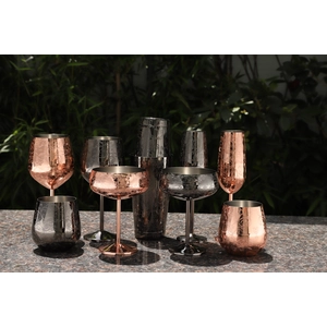
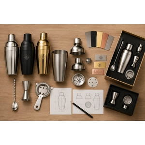
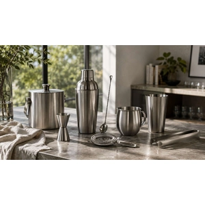
A barware collection looks like one brand when the products repeat a small number of controlled design decisions while allowing each item to keep the shape and construction it needs to work properly. For a range of 12 products, we would not force the shaker, jigger, strainer, mug and ice bucket into one identical form. We would lock the finish family, logo hierarchy, recurring details, packaging language and acceptable variation, then review the samples together before releasing any item for mass production.
This is the practical difference between a coordinated collection and a group of individually attractive products that happen to carry the same logo.
Write One Collection Brief Before 12 Product Briefs
When every SKU begins with a separate reference image, separate color request and separate logo instruction, inconsistency is already built into the project. The first document should describe the collection before it describes the products.
Define who will buy or use the range, where it will be seen, what price and presentation level it needs to communicate, and which item should be recognized first. Then list the full assortment and assign each product a role: hero product, core working tool or supporting accessory. This prevents a decorative ice bucket, a professional shaker and a promotional opener from being developed as three unrelated ideas.
The collection brief should also lock a short set of visual anchors. These may include a finish family, a repeated brushed-and-polished contrast, a recognizable edge or handle detail, a logo hierarchy, and a packaging palette. Three deliberate anchors usually create more unity than applying the same decorative pattern to every available surface.
If the project is still at the individual product development stage, our custom barware design guide explains how use, material, finish, branding, sampling and packaging become a workable specification. The collection brief sits one level above that process: it decides what all of those individual specifications need to have in common.
Separate Fixed Collection Anchors From Flexible SKU Decisions
A strong collection does not make every feature identical. It identifies which decisions create recognition and which decisions must change with product geometry, function or manufacturing method.
Design layer
Lock across the collection
Allow to change by SKU
Approval reference
Finish and color
Color family, gloss direction and intended visual relationship
Surface preparation and process needed for each shape or substrate
Master finish reference plus approved SKU samples viewed together
Form language
Recurring curve, edge, band, handle or texture principle
Exact proportions required for grip, balance, pouring, straining or storage
Product drawings and a side-by-side lineup
Branding
Primary logo, secondary mark, visual weight and orientation rules
Mark size, position and application method
Artwork map and physical branded samples
Functional specification
The collection's quality and use position
Capacity, weight, fit, balance, scale markings and product-specific checks
Individual SKU specification and approved sample
Packaging
Typography, color palette, image treatment and information hierarchy
Box size, insert structure and protection required by each product
Packaging family review and packed samples
This table should become a working control sheet. If a proposed change affects a locked collection anchor, it needs a range-level review. If it only adapts a product to its function without changing the shared visual language, it can remain an SKU-level decision.
Choose Design Anchors That Survive Different Product Shapes
A shaker offers a tall cylindrical branding area. A jigger is small and tapered. A Hawthorne strainer is mostly flat metal, spring and open space. An ice bucket introduces handles, a broad body and a different viewing distance. One graphic treatment will not behave the same way across those objects.
The useful question is not, “How do we copy this design onto every product?” It is, “Which part of this design should remain recognizable when the object changes?” A narrow etched band can become a rim detail on a mug, a waist detail on a jigger and a controlled accent on a shaker. A brushed body with polished edges can become a repeated surface relationship even when the proportions are different. A distinctive handle profile may connect mugs, scoops and buckets while the bar tools rely on the same finish and logo weight.
Avoid choosing an anchor that only works on the largest product. Large all-over graphics often become crowded on a jigger or disappear on a thin handle. Likewise, a tiny emblem designed for a bottle opener may have too little presence on an ice bucket. Test the system at the smallest, most curved and most visually dominant SKUs before approving it as the collection language.
Control Finish Consistency as a Range, Not a Color Name
“Gold,” “copper,” “matte black” and “brushed silver” are directions, not complete collection standards. The apparent result can shift with the base material, polishing, surface texture, product geometry, coating or plating route, and the way light reaches the object. Two products can carry the same color description and still look unrelated when placed beside each other.
For a multi-SKU program, establish a master visual reference and compare actual samples as a group. The review should consider hue, gloss, brushing direction, texture scale and how strongly fingerprints or handling marks appear. The objective is a controlled visual family. It does not require every product to use the same process when different shapes or substrates need different production routes.
This distinction matters on repeat orders. A digital color value alone cannot preserve the full appearance of a metallic or textured finish. Keep the approved physical references, the written process specification and clear sample photographs together. When a substrate, supplier process or finish route changes, compare the affected SKU with the collection references before treating it as an isolated replacement.
Build a Logo System Instead of One Logo Placement Rule
Using the same logo size on every item is one of the fastest ways to make a collection feel inconsistent. The mark becomes oversized on a jigger, weak on an ice bucket and distorted when it crosses a tapered or curved surface.
Create a small hierarchy: a primary logo for products with enough clean viewing area, a simplified mark or monogram for small tools, and a packaging-led branding option for surfaces where a permanent product mark would be forced. Lock the intended visual weight and orientation, then adapt the physical dimensions and position to the product.
The application method can also change without breaking the brand system. A suitable laser mark, silk screen print, decal, etch, molded mark or embossed detail produces different contrast and surface behavior. What needs to remain consistent is the brand expression the buyer approves, not the machine used to create it. Our guide to custom barware logo methods explains how surface, curvature, artwork and expected use change that choice.
Give the Collection an Assortment Hierarchy
Twelve products should not all compete to be the hero. When every SKU receives the strongest texture, largest logo, most complex finish and most elaborate packaging, the range becomes visually noisy and expensive to repeat.
Choose one or two hero items that carry the clearest expression of the collection. A shaker, ice bucket or distinctive mug often has enough surface and presence to do that job. Core tools such as jiggers, strainers and bar spoons can repeat the finish, logo weight or small form details in a quieter way. Supporting pieces can remain simple and rely on packaging, color and placement within the set to belong.
This hierarchy also improves sourcing decisions. Investment in custom forming, deeper texture or more complex decoration can be concentrated where customers will notice it, while standard tooling may be retained for supporting SKUs. The collection gains identity without turning every component into a separate development project.
Approve the Collection Side by Side Before Mass Production
An individually approved sample can still fail as part of a collection. The finish may be warmer than the other pieces, the logo may carry twice the visual weight, or the packaging may use a different image and information hierarchy. These problems are difficult to see when samples are reviewed weeks apart or by different teams.
Arrange a range review before the individual SKUs are released. Place the samples together in the order buyers will encounter them: retail shelf, gift set, hospitality setup or sales presentation. Compare the hero and supporting items, then check the smallest and largest branding applications. Review the packaged products as well as the unpacked tools.
The approval record needs two levels. Each SKU retains its material, dimensions, capacity, function, finish, logo and packaging specification. The collection level retains the master finish references, brand hierarchy, shared detail rules, packaging system and lineup images. If a later revision changes a collection anchor, review its effect on the neighboring products instead of approving the changed item alone.
We also recommend planning the sample sequence around risk. Confirm the most visually dominant product, the smallest branding area and the most process-sensitive finish early. Once those extremes work together, the remaining products have clearer boundaries to follow.
Send the Supplier a Collection Map, Not a Folder of Unrelated References
A useful collection inquiry should include the intended SKU list, the hero product, reference images, brand guidelines, logo files, finish and color direction, target channel, expected quantity by SKU, destination market and packaging approach. Mark which elements are fixed brand requirements and where you are open to manufacturing recommendations.
With that information, we can assess which products can share material, tooling, finish routes, logo methods or packaging components; where a design anchor needs to be translated rather than copied; and which samples should be developed first. If the project then moves into quotation and supplier comparison, use our custom bar supplies manufacturer checklist to prepare the production and RFQ details.
Send us your proposed product list, brand reference, logo files, finish direction, quantities and packaging goal. We will help you turn the separate ideas into a coordinated custom barware collection and outline a practical sampling sequence before bulk production.