












ShenZhen E-BON Industrial Co..Ltd
-Professional manufacturer for the stainless steel products
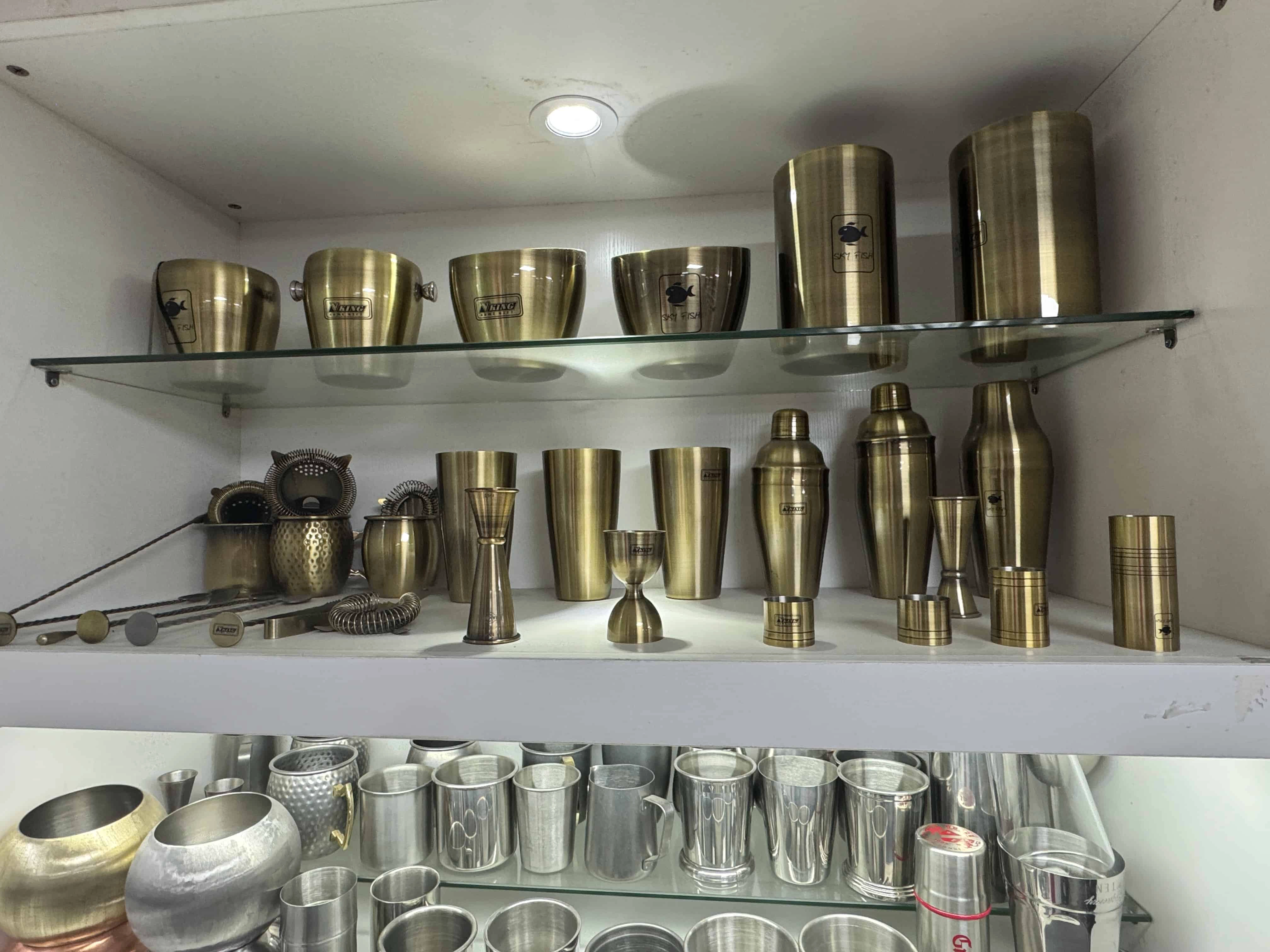
Custom barware is rarely commissioned simply because a brand needs another cup or cocktail tool. It is usually meant to make a collection recognizable: a shaker that belongs on a particular back bar, a copper-tone mug that fits a hospitality concept, or a jigger that staff can use every night without losing the brand identity behind it.
That ambition is worth protecting, but a polished rendering is only the beginning. One shaker project, for example, looked balanced on screen until the wide logo was placed on the curved body. The outer letters began to stretch away from the main viewing angle. We narrowed the artwork, moved it into the clearest visible area, and confirmed the new proportion on a physical sample. The logo method had not failed. The original placement simply ignored the product it was being applied to.
Good custom barware design develops in this way: the brand idea remains visible, while each decision is adjusted to the material, shape, use, cleaning method, packaging, and production process. The following guide shows what should be settled before a quotation becomes an order.
Before discussing steel grades, finishes, or logo methods, define where the product will appear and what it needs to communicate. A cocktail set sold in premium retail packaging has a different job from tools used behind a busy hotel bar. A promotional mug may need immediate visual impact; a permanent hospitality range must continue to look consistent after repeated handling and replenishment.
A useful brief does not need to be long. Reference images, the intended buyer or venue, the drink or service context, the destination market, the target quantity, and the expected selling position are enough to begin. These details help us distinguish between a feature that supports the concept and one that only adds cost.
This is also the right time to decide whether the project is one hero product or a coordinated range. A shaker, jigger, strainer, spoon, mug, and ice bucket do not need identical shapes to belong together. Repeating the finish, logo treatment, handle detail, or packaging color can create a stronger family than forcing every item into the same visual formula.
Once the direction is clear, turn it into requirements that can be sampled and checked. Capacity, balance, grip, lid fit, pouring control, handle clearance, base stability, and cleaning method matter differently across products. The specification should emphasize the details that affect use rather than filling a sheet with numbers that nobody will inspect.
For a cocktail shaker, the parts must fit securely but still open after mixing with ice. For a serving tray, the carrying area and edge design matter more than a decorative dimension that never affects handling. If the products will be packed as a set, their contact points, weight distribution, insert structure, and carton size should be considered before every item is finalized.
Terms such as premium, heavy, or professional are useful for describing an intention, but they cannot serve as acceptance criteria. We translate them into a material choice, weight range, finish reference, functional requirement, or approved sample so the same expectation can survive production.
The same color can be produced through very different constructions. This is especially important with copper-tone barware. A buyer once asked us to develop a “copper Moscow Mule mug,” but the real priority was the warm copper appearance, not a copper drinking surface. We specified food-grade stainless steel for the interior and copper-colored electroplating on the exterior, then focused the sample review on finish consistency, adhesion, oxidation resistance, packaging protection, and the correct care instructions.
That clarification changes the product completely. Solid copper, copper-lined construction, and copper-plated stainless steel may look similar in a photograph, but they have different food-contact surfaces, care requirements, costs, and logo options. The quotation and test plan should identify the actual construction instead of relying on a color name.
Finish approval also needs a physical reference when appearance matters. Polished, brushed, powder-coated, painted, and electroplated surfaces respond differently to light, fingerprints, friction, and marking processes. A screen image cannot reliably show gloss, brushing direction, metallic depth, or the variation that remains visible under bar lighting.
Testing should follow the real construction and claim. Material documentation can support the food-contact surface. Coating or plating checks can address adhesion and corrosion risk. If dishwasher resistance is part of the sales claim, the cleaning conditions and acceptance method must be agreed rather than assumed. Not every product needs every test, but every important claim should have a suitable way to confirm it.
Logo selection starts after the material, finish, and usable marking area are known. Laser marking, silk screen printing, decals, etching, molded marks, and embossing each create a different result, but no method is automatically best for every item. Contrast, line width, color count, curvature, coating, production quantity, and expected wear all influence the choice.
Placement can matter as much as process. A logo may be technically printable yet disappear behind a shaker grip, sit too close to a mug handle, cross a weld, or distort around a tapered body. Large graphics need to be reviewed from the angle at which the customer will actually see the product, not only as a flat file.
We therefore confirm the production artwork, physical size, position, orientation, and visible contrast together. If fine text or a complex emblem will not reproduce cleanly, the practical answer may be a simplified production version rather than a larger or more aggressive process. The objective is not merely to put a logo on metal. It is to make the mark look intentional on that particular product.
Some of the most important problems are easy to miss because they do not dominate the rendering. During one jigger sample review, the exterior branding looked correct, but the internal scale was difficult to read under typical bar lighting. Enlarging the brand mark would not improve the product. The useful change was to adjust the scale position and contrast, then verify the marked volumes before approval.
This is why functional markings should be treated separately from decorative branding. A scale line must be visible at the angle of use, correspond to the intended volume, and remain legible under the agreed cleaning conditions. Similar thinking applies to strainer spring fit, shaker lid release, mug handle clearance, tray balance, and the edges of metal tools.
The buyer does not need to predict every manufacturing problem in advance. That is part of the supplier's role. The buyer does, however, need to explain what must work in practice. With that information, we can identify which details deserve a prototype, measurement check, finish test, or packaging trial.
A sample should answer the unresolved questions in the project. If the material and shape are already proven, the sample may focus on color, logo, and packaging. If the product introduces a new construction, the review should spend more time on function, fit, food-contact surfaces, cleaning, and durability.
Review the item in the order it will be used. Handle it, assemble or open it, pour or measure with it where relevant, inspect the finish under consistent lighting, check the logo from the normal viewing angle, and place it in the intended packaging. Written comments and photographs are more reliable than messages such as “make it a little darker” or “move the logo slightly.”
Packaging belongs in the same review. Individual protection can prevent plated, polished, or painted surfaces from rubbing during transport. Set packaging must also hold products securely without making the carton unnecessarily large. A good-looking sample that arrives scratched is not ready for bulk production.
Approval becomes useful only when it can be repeated. The final production package should identify the drawing, critical dimensions, material and food-contact construction, finish reference, logo file and process, logo position, packaging structure, test requirements, inspection points, and the approved sample version.
Not every dimension needs a tight tolerance, and not every visual detail needs a laboratory test. Control the features that affect function, compliance, appearance, assembly, or the buyer's promise to the market. Allow normal production flexibility where it does not change the approved result.
The aim is not to create paperwork around a product. It is to make sure that the idea approved by the brand can be produced, packed, shipped, and reordered without being reinterpreted each time.
The strongest custom barware projects keep their original character while resolving practical questions early. A curved logo, a copper-tone finish, or a hard-to-read scale may look like a small detail, but each one can decide whether the finished product feels considered or compromised.
Send us your product reference images or drawings, logo file, target quantity, destination market, and intended use. We will assess the workable product construction, finish, logo method, testing needs, and sampling route at no charge, then prepare a practical sample plan for your review.